What the product is built for
Help prospective buyers understand a property portfolio, explore individual developments and make an enquiry with useful context.
Who it serves
People exploring residences and commercial properties in Tétouan and Cabo Negro, plus the team receiving their enquiries.
The product experience
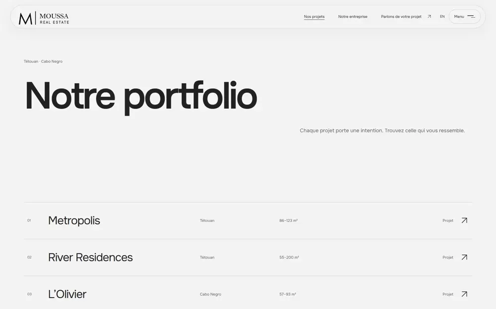
The portfolio leads into distinct development experiences. Visitors can inspect galleries and a landmark-based masterplan, select residence preferences and carry that context into contact. French and English routes serve the same underlying portfolio.
Technology behind the experience
Shared content and routing support the site foundation, while separate campaign components give each principal development its own composition. Responsive media and on-demand films manage visual weight. Validation, private enquiry records and receipts support the contact flow; redirects and metadata connect the rebuild to known legacy URLs.
A property portfolio rebuilt as a connected digital experience.
Beyond a visual refresh
Moussa Real Estate’s brief covered a full website redesign and rework, shaped by six months of planning. The rebuilt experience has to introduce the company, distinguish its developments and help a prospective buyer move from interest to a useful enquiry. That requires more than a new homepage: content, navigation, property presentation, media delivery and contact handling all need to work together.
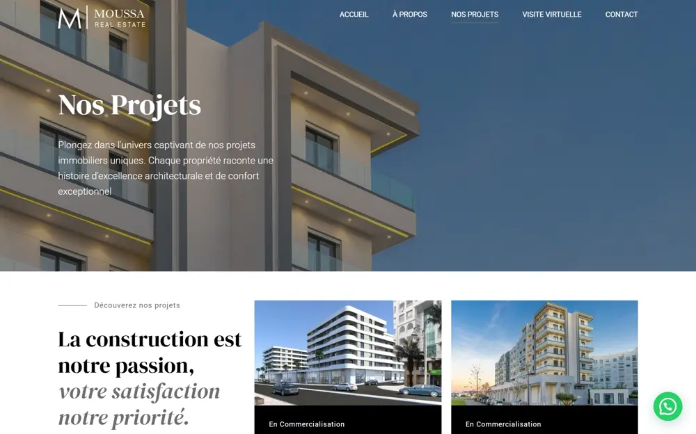
The local rebuild documents 16 routes in French and English, producing 32 language-and-page combinations. The scope includes the homepage, portfolio, seven developments, company information, contact, commercial premises, virtual visits and policy pages. That breadth makes consistency important, but the principal developments also need enough freedom to express their own character.
One foundation, distinct property experiences
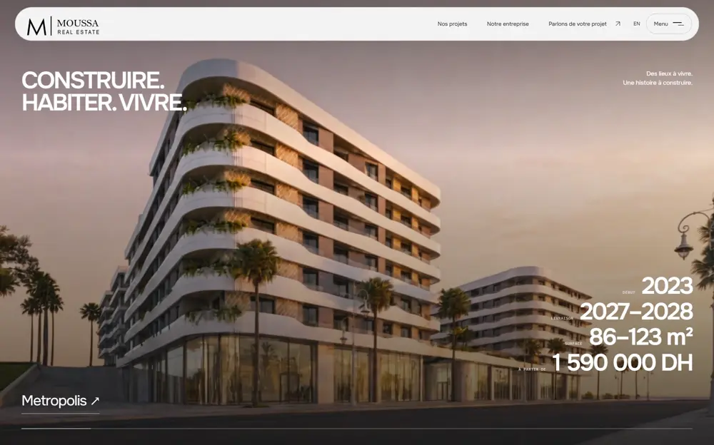
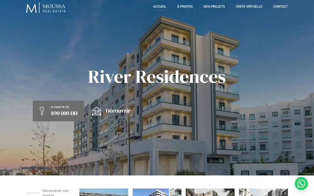
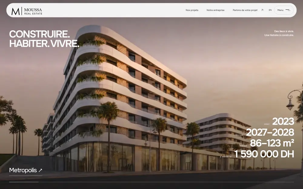
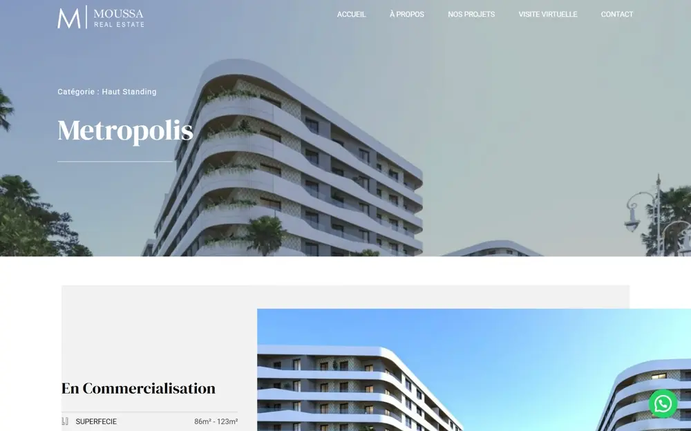
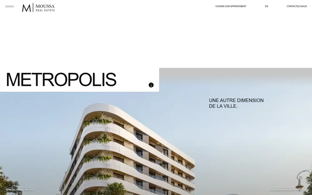
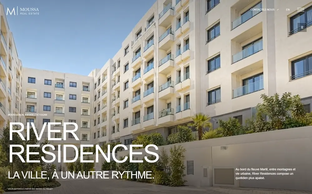
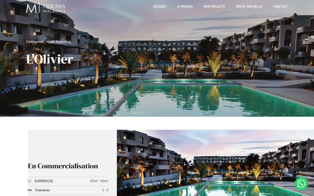
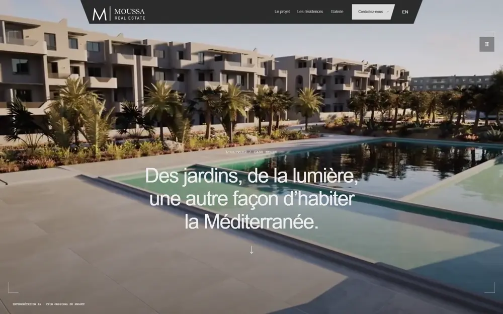
The architecture uses Next.js, React and TypeScript, with shared site content and separate campaign compositions. Metropolis, River Residences and L’Olivier have distinct colour, hierarchy, layout and motion treatments. The Amina developments remain accessible through the shared portfolio rather than being lost behind the flagship campaigns.
Separating shared content from campaign presentation lets the site retain a coherent navigation and language structure while giving each development a more specific visual story. The content model holds project facts, bilingual copy and contact details; campaign modules control the chapters and interactions that make each page different.
Language handling is part of that foundation. French keeps the root URLs and English uses an /en prefix. Arabic is withheld until reviewed content is available. The design therefore supports the languages documented in the build without presenting an unreviewed translation as a finished customer experience.
Making exploration interactive
Metropolis includes an illustrated masterplan with selectable landmarks and an expanded viewer. Visitors can inspect the image through zoom, pan and reset controls, while mobile users have large landmark buttons beneath it. The masterplan is a raster architectural illustration with interactive navigation, not an orbitable 3D model or a certified survey.
River’s gallery treats navigation as part of the browser experience. Selecting an image updates numbered URL state, the Back action restores the previous image, and Escape closes the dialog. That turns a gallery from an isolated overlay into a journey that can be revisited and navigated predictably.
These interactions also carry practical accessibility responsibilities. The recorded checks cover keyboard dismissal and focus return for galleries, along with mobile landmark selection. Those details support the experience when someone does not use the same input method or screen size as the designer.
Turning interest into a useful enquiry
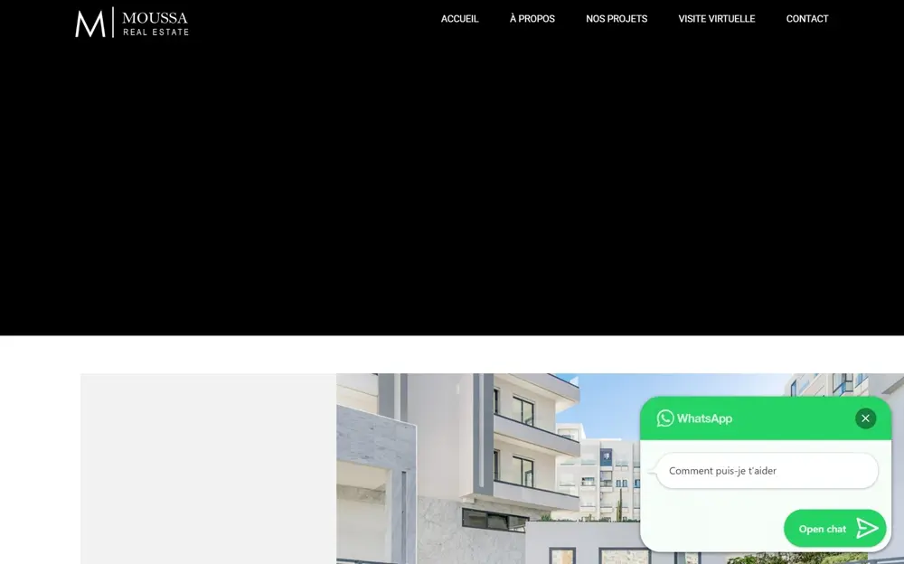
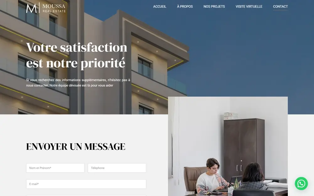
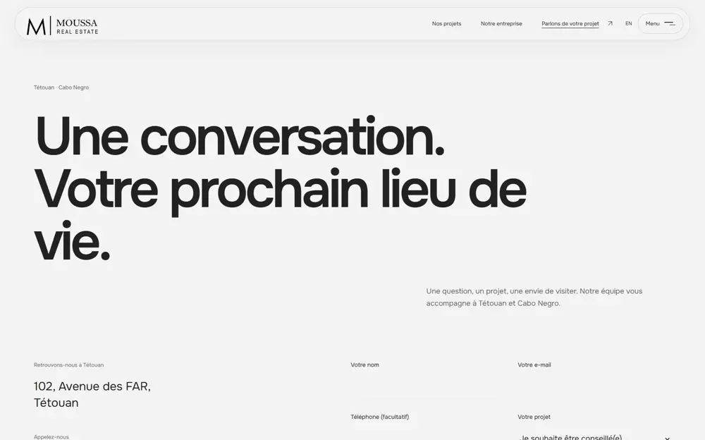
The contact journey carries context forward. A residence preference control can send the selected development and bedroom preference into the enquiry form, reducing the amount a visitor has to explain again. Direct phone, email and WhatsApp alternatives remain available alongside the form.
The form validates input on both the client and server, persists a private record and returns a receipt. The local build includes a read-only enquiry inbox, with records stored outside public assets. A labelled test enquiry was submitted and checked in that inbox during the documented QA process.
This is a working local delivery mechanism. Automatic email and a live CRM connection are not represented as completed integrations. A production rollout must provide persistent private storage and the appropriate deployment configuration; the case study separates implemented enquiry handling from services that have not been connected.
Media, speed and motion
Property storytelling relies on large imagery and film, so asset delivery is an engineering concern from the outset. The rebuild uses responsive image derivatives, explicit image dimensions, priority loading for hero imagery and lazy loading for secondary media. Films load on demand, and the mobile homepage starts with a portrait still rather than automatically loading a background film.
The implementation also uses self-hosted typography, reduced-motion fallbacks and an animation loop gated by visibility. The intention is to preserve the atmosphere of the development without making every device download and animate every visual at once.
The retained September 17 local Lighthouse report records mobile performance scores from 88 to 93 across four representative pages, with zero measured layout shift. Those are historical local laboratory results, not current field measurements or a guarantee of production speed. The report also identifies remaining mobile loading and image-compression opportunities.
Reworking the site without abandoning its URLs
The migration work maps known legacy paths and WordPress page IDs to replacement destinations. French and English pages have canonical URLs and language alternates, alongside metadata, social cards, structured data, a sitemap and robots handling. Unknown routes return a proper 404 response.
The recorded redirect checks cover six legacy paths and a representative WordPress ID. This is a defined migration surface, not an assertion that every historic inbound URL has been discovered. A production migration still needs real traffic or Search Console exports to identify additional aliases and a post-deployment check of the canonical host and redirects.
Development process and verification milestones
Six months of planning shaped the direction of the website. The implementation brings that direction into content organisation and shared routing, development-specific page composition, interactive exploration, enquiry handling and migration checks. Visual refinement and technical verification meet in the browser: a property page must communicate clearly and still behave correctly when translated, narrowed to a phone or navigated with a keyboard. The six-month period refers to planning, not a measured coding duration.
The September 17 QA record reports passing production and TypeScript checks, two enquiry tests, and an HTTP sweep covering 32 pages, 68 assets and seven representative redirects. The principal project pages were reviewed across nine viewport widths from 320 to 1920 pixels. A September 18 entry documents further campaign redesign validation. These are dated verification checkpoints, not a reconstructed start date or total build duration.
The delivered scope described here is the local rebuild. Public deployment, real CRM integration, physical-device testing and field Core Web Vitals were outside the completed checks documented in those reports. Keeping those boundaries clear makes the development story more useful: it shows what was built, what was tested and what belongs to the next release stage.